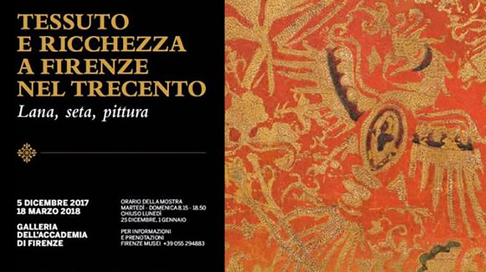
Galleria dell’Accademia
5 dicembre 2017 – 18 marzo 2018
Di Simona Anna Vespari (Università degli Studi di Firenze)
Tessuto e ricchezza a Firenze nel Trecento. Lana, seta, pittura. E’ questo il titolo della mostra che si è aperta il 5 dicembre scorso e avrà luogo fino al 18 marzo 2018 nelle sale della Galleria dell’Accademia, a cura della direttrice del museo Cecilia Hollberg. Si tratta di un evento molto interessante, non comune, che si concentra principalmente sull’importanza dell’arte tessile a Firenze, analizzata sia da un punto di vista economico che nel campo della produzione artistica. Può essere considerata un viaggio attraverso la storia dei tessuti tra la fine del Duecento e per tutto il Trecento, in particolare a Firenze, periodo in cui la città divenne un luogo fondamentale negli scambi commerciali.
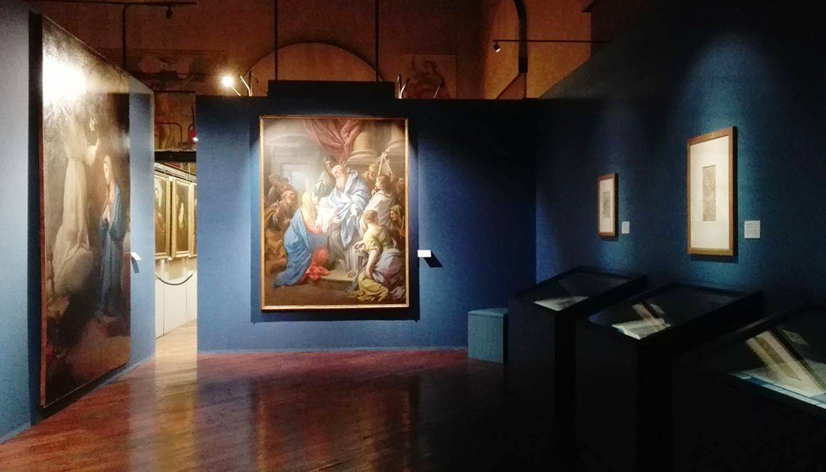
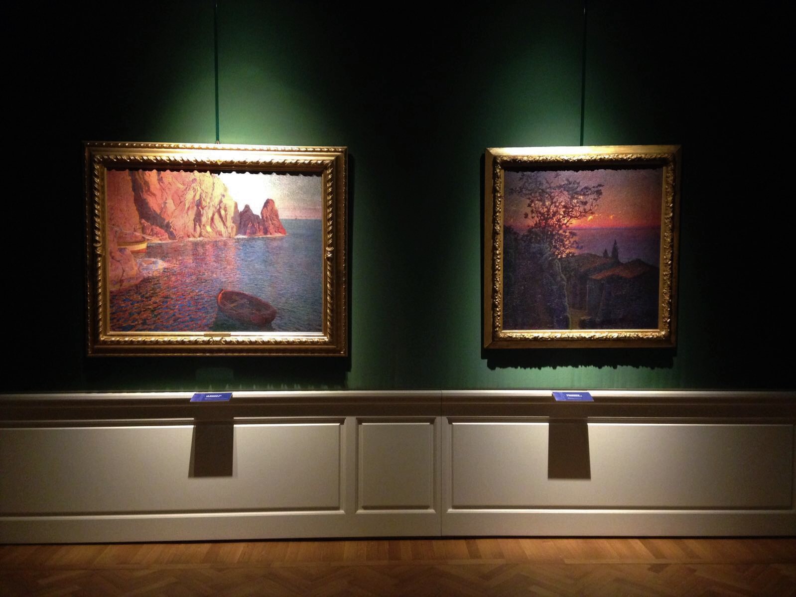
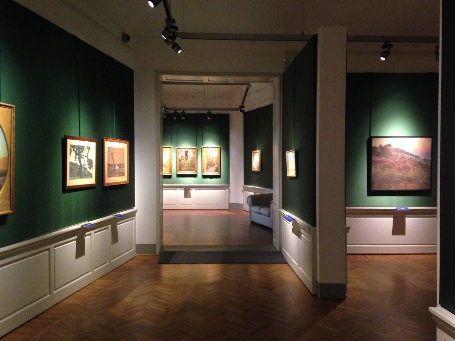
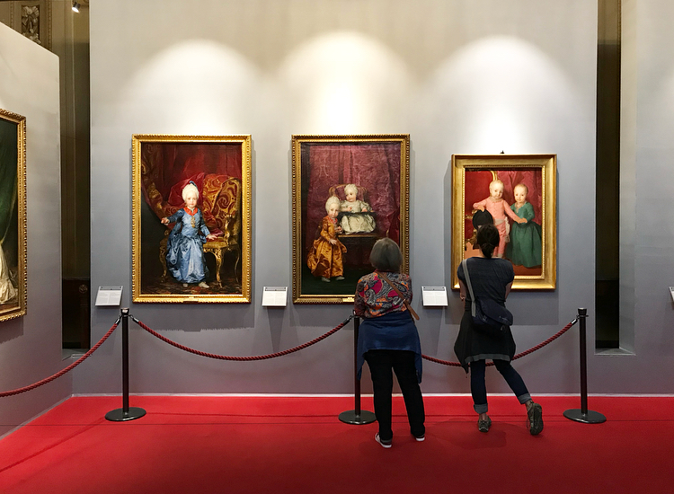
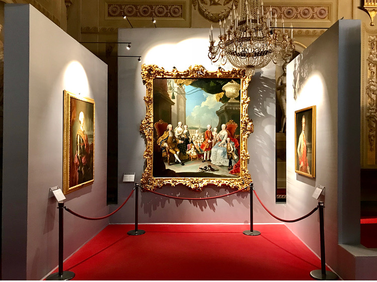
Il visitatore entrando dalla Galleria dell’Accademia si ritrova in un ambiente governato dalla semioscurità, effetto che da maggiore intimità al luogo e soluzione che fa risaltare come assoluti protagonisti i tessuti, ben illuminati, e quindi al centro dell’attenzione.
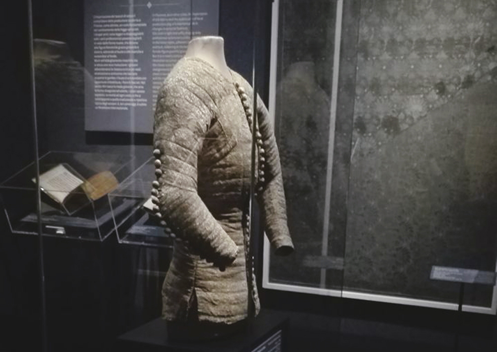
La mostra si apre con uno sguardo al contesto storico nel quale quest’arte comincia a svilupparsi: all’interno di teche, si trovano nella prima sala testimonianze dell’Arte della Lana, corporazione importantissima a Firenze, presente attraverso l’esposizione di sigilli, statuti, pagamenti che rendono chiara la sua attività. A dare il benvenuto al visitatore è il piccolo vestitino in lana, prestato dal National Museum di Copenhagen, confezionato alla metà del XIV secolo per una bimba e recuperato in Groenlandia dagli archeologi: l’opera, posta in una teca di vetro, direttamente in corrispondenza dell’entrata principale documenta come il concetto di moda comincia a svilupparsi già da quest’epoca.
Giusta la scelta in questa prima sala di posizionare, vicino all’ingresso e prima dell’inizio della visita, un punto in cui sono stati collocati quattro tipi di stoffe offrendo al visitatore anche un’esperienza tattile, importante visto l’argomento su cui verte l’esposizione.
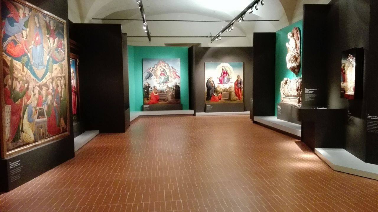
La mostra segue un percorso cronologico e si compone di varie sezioni, in ognuna delle quali ci si concentra su un tipo diverso di decorazione; si parte così con la prima sezione dedicata alle Geometrie mediterranee: insieme a pezzi di tessuto dalla fantasia che richiamano il mondo islamico, ci troviamo di fronte alle due opere più antiche di tutta la mostra che appartengono ancora alla fine del ‘200. Si tratta della Madonna di San Remigio, proveniente appunto dalla chiesa da cui prende il nome e la grande Croce di fine Duecento, appartenente alla Galleria dell’Accademia e restaurata per questa occasione, dominante in posizione centrale: in quest’ultima opera colpisce particolarmente il tessuto decorato a motivi geometrici del tabellone centrale, testimonianza dello splendore – in gran parte perduto – delle opere che ornavano le chiese in questo periodo.
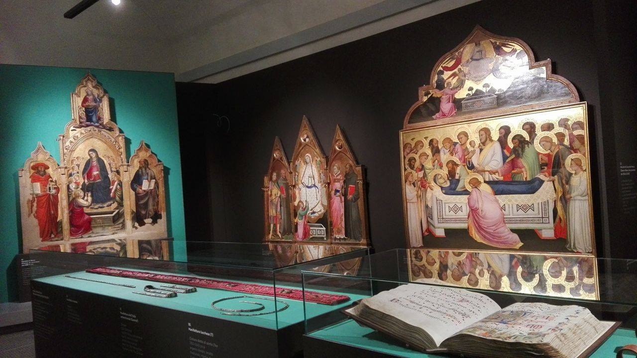
In ogni sezione è esposta quindi almeno un’opera pittorica in cui si ripropone la decorazione del tessuto in esame: questa scelta è interessante e porta il visitatore a guardare l’opera con occhi nuovi, probabilmente in un modo diverso da quello abituale, ricercando il dettaglio decorativo della stoffa in un continuo confronto tra tessuti reali e dipinti.
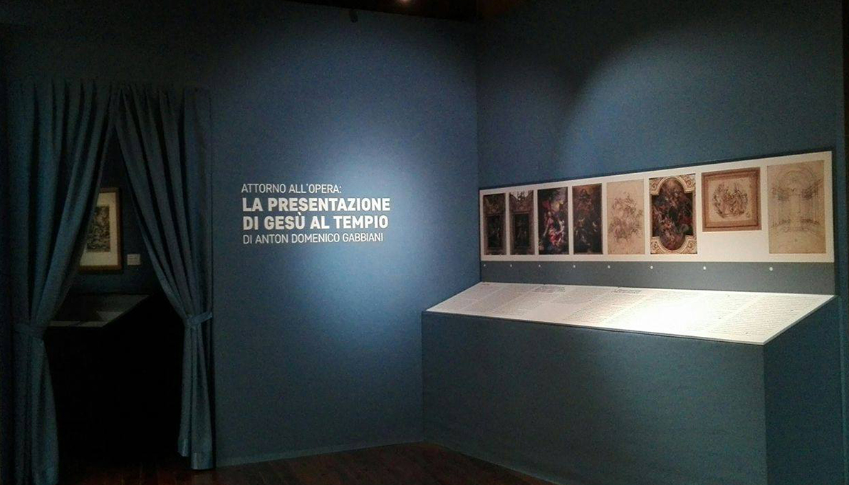
Il blu è il colore che fa da filo conduttore per l’intera esposizione: si è scelto infatti di utilizzare questa tinta per le pareti, in stretto richiamo ai tessuti esposti con tanto di decorazioni con animali e simboli, così come blu è tutto il materiale didattico presente. Le didascalie sono molto chiare, poste vicino all’opera e ben visibili mentre i pannelli esplicativi scritti in doppia lingua, uno per ogni sala, forse risultano troppo brevi per il visitatore che si approccia per la prima volta con questo argomento, facendo comprendere maggiormente il contesto che ruota attorno alle opere esposte ma non riuscendo a creare un vero e proprio percorso lineare.
Al termine del percorso troviamo la sezione dedicata ai velluti ed anche, in posizione d’onore a salutare il visitatore in questo suo viaggio nel mondo dei tessuti due e trecenteschi, il bellissimo piviale conservato al Museo del Bargello che documenta la sfarzosità e la ricchezza e l’importanza raggiunta dalla città di Firenze in questo campo nel corso del Quattrocento.
Weave and wealth in Florence in the Fourteenth Century
Wool, silk, painting
Accademia Gallery
5 December 2017 – 18 March 2018
By Simona Anna Vespari (University of Florence)
Weave and wealth in Florence in the fourteenth century. Wool, silk, painting. This is the title of the exhibition that opened on December 5, 2017, and will take place until March 18, 2018, in the halls of the Galleria dell’Accademia, by the director of the museum, Cecilia Hollberg. It is a very interesting, uncommon event that focuses mainly on the importance of textile art in Florence, analyzed both from an economic point of view and in the field of artistic production. It can be considered a journey through the history of fabrics between the end of the thirteenth century and throughout the fourteenth century, especially in Florence, a period when the city became a fundamental place in trade.
The visitor entering the Accademia Gallery finds themselves in an environment controlled by semi-darkness, an effect that gives greater intimacy to the place and solution that brings out the absolute protagonists of the well-lit fabrics, and therefore the center of attention.
The exhibition opens with a look at the historical context in which this type of art begins to develop. Inside the showcases, in the first room there are testimonies of the Wool Guild, a very important guild in Florence, present through the display of seals, statutes, payments that make the activity clear. To welcome the visitor is a small wool dress, lent by the National Museum of Copenhagen, made in the mid-fourteenth century for a child and recovered in Greenland by archaeologists. The work, placed in a glass case, directly in the main entrance documents how the concept of fashion begins to develop already from this era.
In the first room near the entrance right before the start of the exhibition there is a information point where four types of fabrics are placed offering the visitor a tactile experience, which is important considering the nature of the objects on display.
The exhibition follows a chronological path and consists of various sections, each of which focuses on a different type of decoration. It starts with the first section dedicated to Mediterranean Geometries: together with pieces of fabric with a fantasy that recall the Islamic world, the visitor is faced with the two oldest works of the entire exhibition belonging to the end of the 13th century. The Madonna of San Remigio, coming from the church from which it takes its name and the great cross from the late thirteenth century, belonging to the Accademia Gallery and restored for this occasion, which is places in a dominant in central position: in this last work particularly striking fabric decorated with geometric motifs on the central board, testimony to the splendor, largely lost, of the works that once adorned the churches in this period.
In each section, at least one pictorial work is exhibited in which the decoration of the fabric under examination is proposed, this choice is interesting and leads the visitor to look at the work with new eyes and in a different way from the usual one, looking for the decorative detail of the fabric in a continuous comparison between real fabrics and paintings.
Blue is the color that acts as a guiding thread for the entire exhibition. In fact, they chose to use this color for the walls, in strict reference to the fabrics displayed with lots of decorations with animals and symbols, just as blue is all the material didactic present. The captions are placed close to the work and clearly visible while the explanatory panels written in two languages, one for each room, are perhaps too short for the visitor who approaches for the first time with this topic, making it easier to understand the context that revolves around the exhibited works but failing to create a real linear path.
At the end of the path we find the section dedicated to velvets and also, in a position of honor to greet the visitor on his journey through the world of twentieth and fourteenth century fabrics, the beautiful piviale preserved in the Bargello Museum which documents the lavish and the richness and the importance reached by the city of Florence in this field during the fifteenth century.